
Common
Responsive Web Design
My Role: Brief Creation, UX UI Design
CHALLENGE
Identifying the areas of greatest impact, design a universally easy to use responsive website which connects new arrivals with the local community and promotes understanding and integration.
SOLUTION
A mentorship program and platform where people can connect with various degrees of involvement; a digital hello, outings, events and mentorship.
APPROACH
4 week (80 hours) design sprint.
Research, Define, Design, Test were all allocated a week with a human centered design approach to reduce risk and uncertainty.

RESEARCH
Secondary research and competitive analysis were the starting point in understanding both the design challenge and current resources available to new arrivals and community involvement.
At a glance the research revealed;
By the end of 2016, 65.6 million individuals were forcibly displaced worldwide as a result of persecution, conflict, violence, or human rights violations. This includes;
22.5 million refugees in the world
40.3 million internally displaced people; and
2.8 million asylum-seekers.
Key issues when arriving to a host nation;
Understanding the government systems
Understanding the job market
Learning the local language
Education; high school & university
Social Networking sites are particularly relevant for refugee participants to acquire language and cultural competences, as well as building bonds and bridging social capital.
Diving deeper, five empathy interviews were conducted to gain insight into the topics of volunteering and refugees. I was fortunate enough to speak with a former refugee (now US citizen), a program manager at a local refugee centre, and three local residents. A summary of my findings can be seen here.
From these insights, three personas were generated to address the varying needs and desires of the users; the refugee, the volunteer and the non-profit employee.
Research lead to three personas; The Refugee, the Volunteer and the Non Profit Employee.
Isolating the key concerns for the new arrivals, a list of recommendations was made before moving into defining the project.
Mobile first when building the responsive website as refugees relied heavily on their mobile phones
1:1 support for a family or individual
Inclusive of refugees and asylees
Clear language aids online for both government and supportive systems.
Access to job training and industry networking
Government system support needed
Community engagement through social media
Endorsed by a larger more established organization for greater trust
Screening process for volunteers
Individual Stories; quotes, images and video
Refugees can connect directly with the service
Live chat availability for the human element
DEFINE
Drawing on the research and recommendations, I began brainstorming from an opportunity statement that lead me to a solution;
Create a mentorship program and platform where people can connect, with varies degrees of involvement; a digital hello, outings, events and mentorship.

Generating an opportunity statement (people + need + insight), I began brainstorming possible solutions and defining the direction of the project.
With this ambitious idea in mind, a site map, task flow, user flow and features list was created to define the parameters of the first release and identify the core characteristics; an avenue to connect new arrivals with the community.
The challenge was always going to be how I could address the needs of refugees. With the time restraints of the project and having greater access to potential volunteers, I focused the design sprint on the volunteer and their experience applying to the program.
With more access to the volunteer user group, I created a task flow for volunteer signup process.
Results from the empathy research revealed that the volunteers wanted the flexibility to control the amount of involvement in the program. With this in mind, I started sketching out a login area, which would allow users to connect through a digital hello, set up meetings and social events. Very quickly, I realized the complexity of this task and returned to my feature list to redefine what could be achievable during this sprint. I redirected my energies to the core of this mission; inviting people to connect and get involved with their community in person which could be done with the assistance of staff at the organization.
DESIGN

Early exploration of membership account page, allowing users to reach out and say a digital hello.
Looking at the homepage, research revealed that statistics can be overwhelming and the importance of personal stories are key to engaging people in an issue. Next, users seek a clear statement of what the organization is hoping to achieve and their legitimacy through partnerships.
There are multiple sides to this story, and there must also be an opportunity for the new arrival to identify with the story and see clear benefits of getting involved. As well as text, competitive research revealed video was often used as a direct way to introduce the organization.

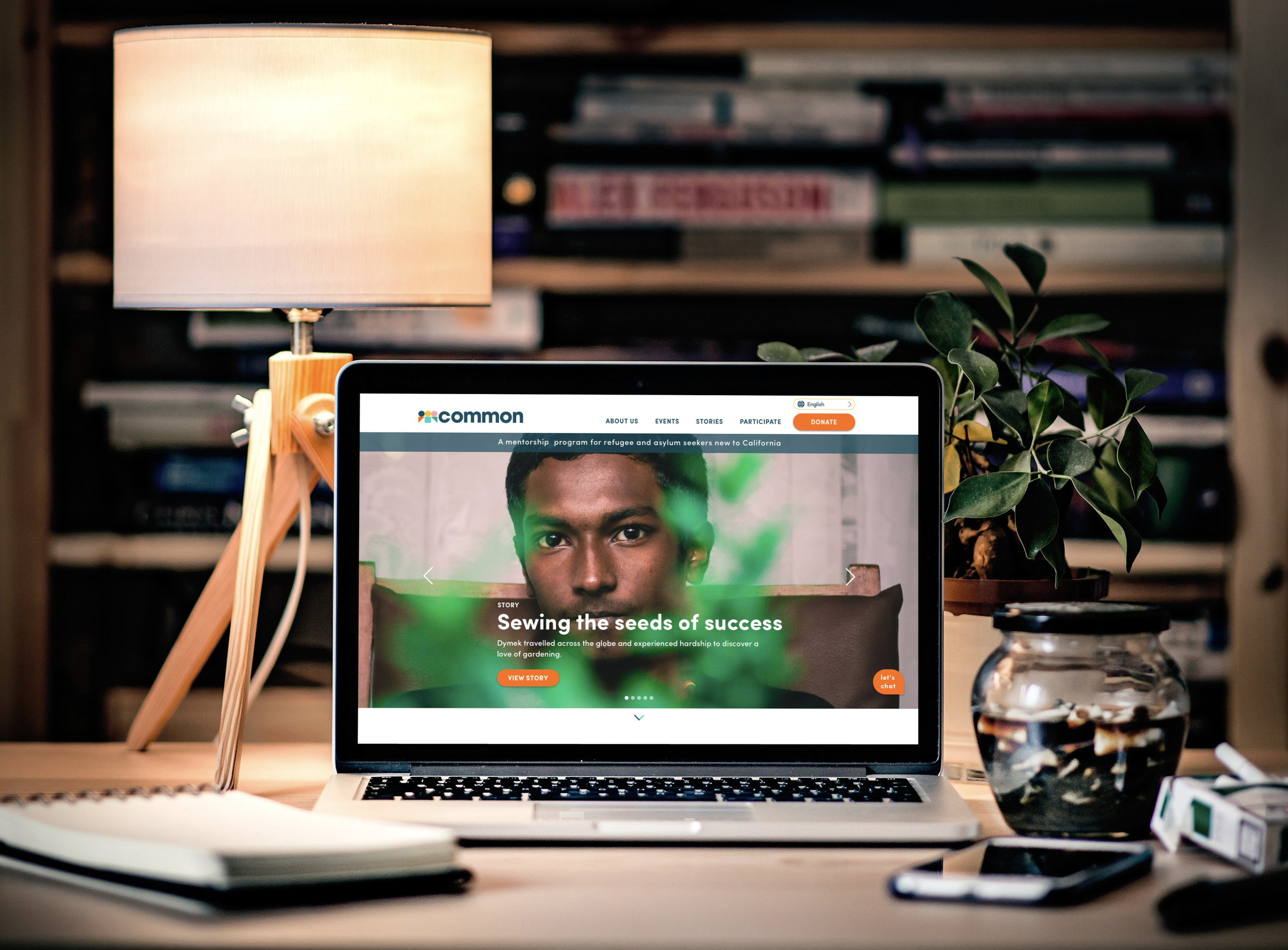
Drawing on the research, the responsive homepage highlights individual story, program goals and how to get involved.
It was essential to create a brand that was approachable, community driven and supportive. Brain storming a name that would capture all of this, I arrived at Common.
Common People, Common Ground, Common America.
These themes of community and interconnection influenced the exploration of the logo design. Bright, playful and welcoming colors were chosen to reflect the key elements of the brand; providing an uplifting community, inclusive of new arrivals and the local volunteers.
BRAND

Brainstorming the programs name to incorporate global inclusiveness.

Journal exploration for the common logo.
Variations on the common logo created in Sketch app. The final design was chosen for this simplicity of shape and narrative of people coming together.
The logo, watermark, text and colours were all chosen to be welcoming, open, safe and joyful.
UI DESIGN
Keeping in mind the broad spectrum of users, I wanted the website to feel open and clean while maintaining legibility. Navy and white created contrast and became a visual aid in sectioning the information. Color added a playful accent. People are the center of this story, so realistic, honest photography also became a key part of telling a story.
The homepage starts with an individual story to humanize the experience.
Volunteer page with the use of icons to explains how to get involved.
Screens from the Volunteer application form.
Ideation and iteration created a version one of the volunteer task flow, but I really needed input to validate and highlight unforeseen pain points to push this project further. Identifying three users based on the volunteer persona, I conducted usability testing on the sign up process.
From the raw data, an affinity map helped isolate the key issues that were high in severity and frequency.
TEST
Affinity Map allowed me to break out the key information from the user testing, highlighting both success and pain points. This lead to a prioritization of changes based on frequency and severity.
Expanding the volunteer task information was key to the users feeling like there was a spot for them in the community. With the increased text, additional imagery was introduced to both create informational sections and allow the users to visualize their involvement in the program.
The outcome is a more fluid and informative volunteer page.
Usability testing lead to key changes driven by the user.
The resettlement of refugees and asylum seekers is a complex issue. One which I feel I only had the chance to graze but would love to explore further as it is an important issue in today’s community.
With a quick turnaround, the research was largely focused on the narrowing down the needs of the new arrivals.
Looking towards next steps, further research and development into mentoring, the refugee registration process, events and resources could also uncover further opportunity and shape the first release.
Beyond this release, this project offers further development, allowing users to connect directly through an online community, creating an avenue for asking questions, creating outings and forming supportive social networks.